
01 / DDD
02 / INPUT
<Data
<Design
<Direction>>
>Once the system is sett, every creative direction plugs, screams and merges right into it>>>
(Scroll) ▾
I build difference through data, design systems, sharp positioning, and emotional cues, crafting work that flows smoothly across digital, print, strategy, and instinct.
My approach blends accessibility, data, user behavior, brand clarity, and universal design with the mix of UX, motion, and personality that defines my craft.
I create dynamic design systems that adapt seamlessly across digital and analog aesthetics.
My approach goes beyond the traditional–I always prioritize accessibility and universal design. With deep experience in design thinking, UX, and illustration, I see the full picture, from the first pixel to the final product. Having worked across multiple countries, cultures, languages and brands with a wide range of clients, I bring a global perspective to every project.
With global experience as both a freelancer and agency designer, and a strong, proud keen eye for detail. I bring a good amount of curiosity well-traveled perspective to every project, from the base idea to the final touch, and launch – and beyond.
Jump over to get to know me, Franck Coz
or just jump to my cases, or keep
on scrolling!

Social:
Instagram >
Agency status:
For hire >
Current location:
59° 54' 45.8" N,
10° 44' 45.9" E.
Capabilities
-
I draw on years shaped by people, agencies, cultures, and the kind of projects that spark real curiosity. My strategic edge comes from living deep inside PR and political-communication environments, where messaging isn’t just crafted, it’s engineered.
At the same time, my creative and production instincts kick in hard when it’s time to build, design, and deliver. From start-ups to established design studios—and even running my own agency back in the day. I bring a mix of experience that keeps my work sharp, adaptive, and unapologetically forward-thinking.
-
I develop identities and brands through a blend of strategy and creativity that gives me a real edge. When I shape an idea, I’m already thinking about how it can be produced and what the realities of execution will bring–whether the goal is B2B precision or B2C impact.
With design as my backbone, I approach every brief through both a strategic and production-focused lens. I keep my eye locked on the deliverables, the core creative message, the visual harmony, the budget, and the full production landscape, so the final outcome isn’t just on-brand, it’s built to perform.
-
When you see the world through a Motion Designer’s eyes, the whole design universe shifts. A simple shape isn’t just a shape anymore, it becomes a story. Move it from point A to point B, and suddenly the magic kicks in; the path it takes becomes the narrative.
That’s when even a basic element or infographic jumps from “Nice touch” to “Hold up, we’re building a whole universe out of this.”
And right there, the Art Director mindset snaps back into play, ready to scale the idea into something bigger, smarter, and fully alive.
-
From managing and shaping a coffee-table book to feeling the weight and scent of fresh 100–150g pages, there’s something about that tactile moment that hits different.
On the digital side, producing a yearly report becomes an opportunity topush beyond the expected. Make it more engaging, more focused, more aligned with the concept. Turn it into a magazine-inspired experience, highlight the core messaging and visuals, and suddenly it connects with a wider audience in a sharper way. You know exactly where that energy comes from.
-
I polish stories into living experiences – Deepdiving in to the concept and story, with detailed steps on each frame, colorgrading, sound, rhythm, and all the way to the final version, all dialed in to elevate content from “nice” to “I felt that! in me, Frank…”
-
Cooking up something sweet…
Some
engagements
Take a look how data and creativity finds the same paths – and becomes a shape, font – or something… Yeah, that’s the beauty!
“We want to showcase our story through our 50 years of innovation. How can we make this as visual as possible without losing our innovation feel and brand core – while still ensuring it's usable across multiple platforms?”
Invo had long wished to improve its web user experience and its customer conversion to its products. So we took the challenge to redesign their website UX (logic) and uplift their GUI with their existing brand elements.

Helsebesøket desired to aim – and resonate with the user's feelings, sense of care, and emotional needs. That warm motherly feeling that you can trust no matter what. How could we pinpoint this into a symbol and brand that could resonate with modernism, while keeping the roots in the traditional medical domain and welfare?
Some brand
performance
Visma
Oslo Bolig
Socialboards
Oslo Bysykkel
iF Forsikring
Forskningsrådet
Hertz
Visma Oslo Bolig Socialboards Oslo Bysykkel iF Forsikring Forskningsrådet Hertz
Nordic Innovation
Oslo Kommune
Rusken
Vedal
Nespresso
GLS
Glamox
Nordic Innovation Oslo Kommune Rusken Vedal Nespresso GLS Glamox
Nobel peace center
Northern Lights
Aneo
Hydro
Bank ID
Vår energi
Sval
Nobel peace center Northern Lights Aneo Hydro Bank ID Vår energi Sval
Circa group
Yrkes trafikk forbundet
Mondelez
Specsavers
Startuplab
Air liquide / Redo
TCS
Circa group Yrkes trafikk forbundet Mondelez Specsavers Startuplab Air liquide / Redo TCS
Fagforbundet
Skagerak energi
Helsedirektoratet
Invo
SPG
NHO
Hurtigruten
Ocura
Fagforbundet Skagerak energi Helsedirektoratet Invo SPG NHO Hurtigruten Ocura
(Scroll) ▾

the book
illustration
identity
/ Case study on its way
Highlighting engagement for Stena’s future scope. Branding it – is the best way to go!
The
Charcter
re-branding
/ Case study on its way
Regarding the intimate theme of the book, we recommended the author to aim for thick, imperfect inked lines in order to bring forward a more personal feeling.
the
Identity
/ Case study on its way
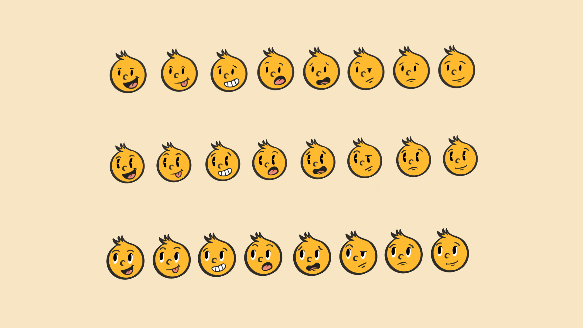
Since I was a kid, even in primary school here in Oslo, I remember how Rusken made us aware of keeping Oslo clean and feeling pride in our city. That message stuck with me. So, when the big day came for me to rebrand Rusken, I was thrilled to take on the challenge and meet Team Rusken’s desired outcome, creating a whole universe and a character that can highlight its message with emotions.


The
Illustration
Identity
/ Case study on its way
We're keeping it simple – introducing clean elements that showcase Invo's various integrations. Why? Simplicity and object reference that resonates with its products. Simplicity cuts the noise and cranks up the clarity for a better CTA.
The
identity
/ Case study on its way
We want to showcase our story through our 50 years of innovation. How can we make this as visual as possible without losing our innovation feel and brand core – while still ensuring it's usable across multiple platforms?