
(Scroll)
redo identity / branding
redo identity / branding
(04) Project Overview
redo
biosolutions
Redo is a Norwegian-Swedish company specializing in the production of biomethane and biofertilizer, with a strong presence across large parts of the value chain. We are committed to utilizing organic waste streams to produce renewable energy and high-quality biofertilizer, reflecting our dedication to sustainability and innovation within the agricultural and energy sectors.
The
Process
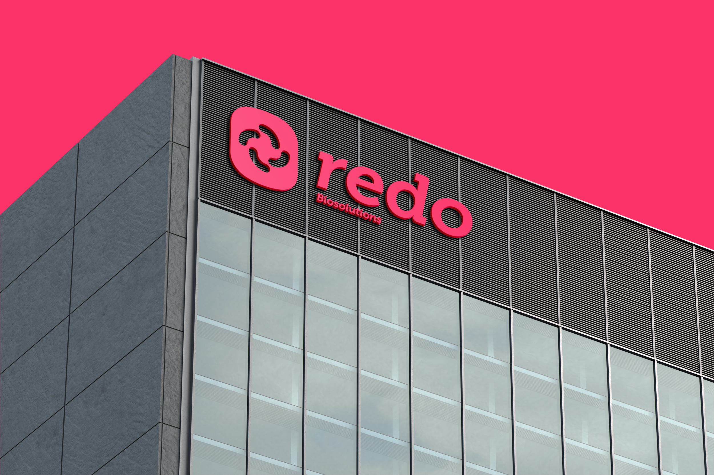
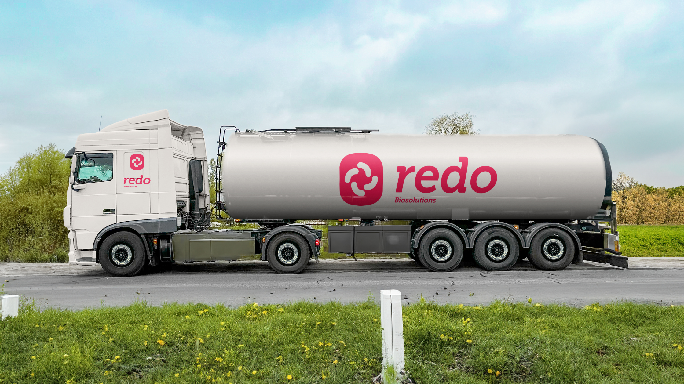
Air Liquide Skagerak and Skagerak Energi wanted to merge their sister companies into one unified company name and brand. We helped both companies reach their naming and branding with the help of our awesome creative team @ Hill & Knowlton.
The challenge for the two companies was to unite under a cohesive brand, look, and tone of voice, so that all could feel that they are part of the brand.
We aimed to establish a stable and identifiable brand that resonates with everyone at Air Liquide Skagerak, its core values, and its clientbase. It also needed to align with each culture’s positioning while targeting the market effectively. Our primary objective was to make their brand recognizable in their industry. Air Liquide Skagerak aspired to stand out in the crowded renewable energy sector. Our team aimed to differentiate them by opting for a distinct color palette, diverging from common industry hues. This approach allowed Redo to emerge as a challenger, bringing fresh ideas and a unique identity to the market.
(Details)
Identity / branding
Type
Biosoultions
Model
Sustainable energy
Category
Designer / Motion Designer
Engagement
Hill & Knowlton
Agency
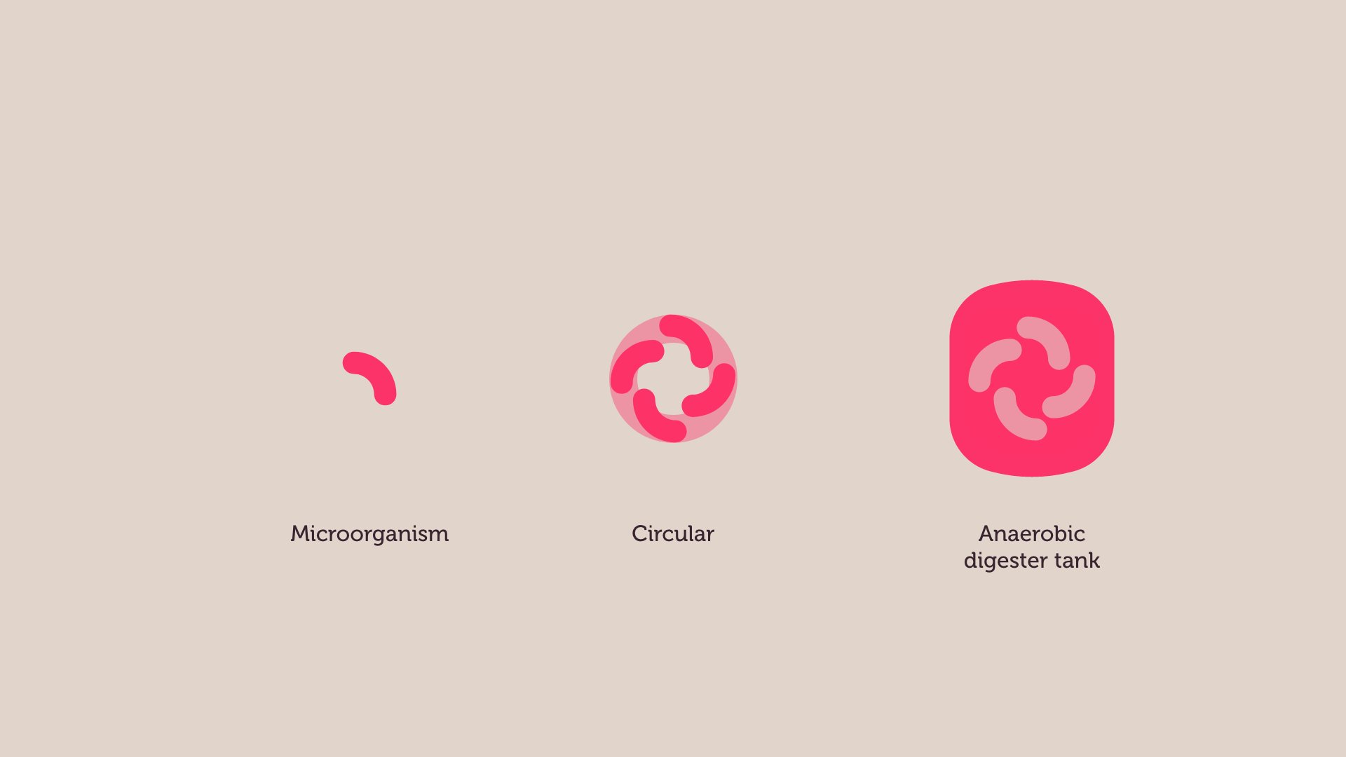
The logo highlights the renewable cycle by emphasizing the role of microorganisms and their processes, highlighting the circular movement. The entire process is concentrated within the Anaerobic Digester tank, where the main procedure is emphasized.
Logo - Symbol and wordmark

Redo logo is constructed of both a symbol and a wordmark. In certain contexts, the tagline may also be used together with the logo, consider where you use it and who you’re communicating with, while adhering to the rules of engagement for the logo.

The wordmark is our signature and should always be prioritized to build brand recognition. The wordmark can be used separately from the symbol; however, in a starting phase of creating brand recognition, the symbol shouldn’t be used as a standalone element without the wordmark.

The symbol highlights the renewable cycle by emphasizing the role of microorganisms and their processes, circularity and the process of Anaerobic Digestion in a tank.
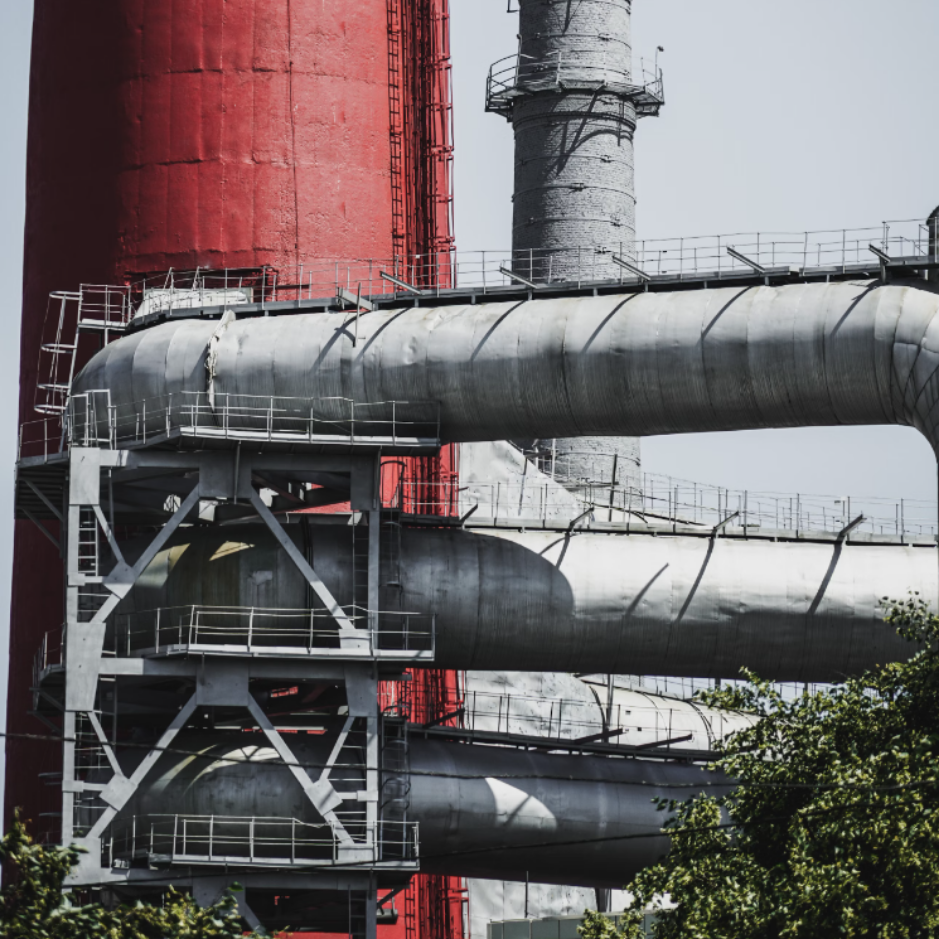
Inspired by refinery elements and their natural surroundings, incorporating a standout color to emphasize the leafy greens.
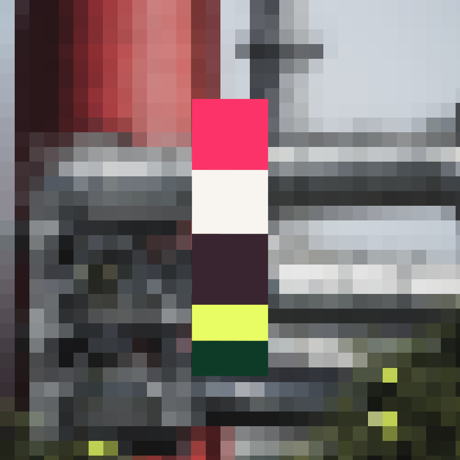
Colors / naming
Our primary colors should always be prioritized in descending order of reference. Note that our three colors can be interchanged, as the contrast-safe margins support this.
We considered universal design principles when selecting the colors and they are WCAG compliant. Please note that the output may vary depending on each screen or device.
Colors - Reference lookup
Our secondary colors complement our primary colors. Use our guide to reference each contrast and ensure visibility.
Type face
Redo's font reflects the visual tone and tradition, while also signaling a modern motion direction for a more approachable brand.
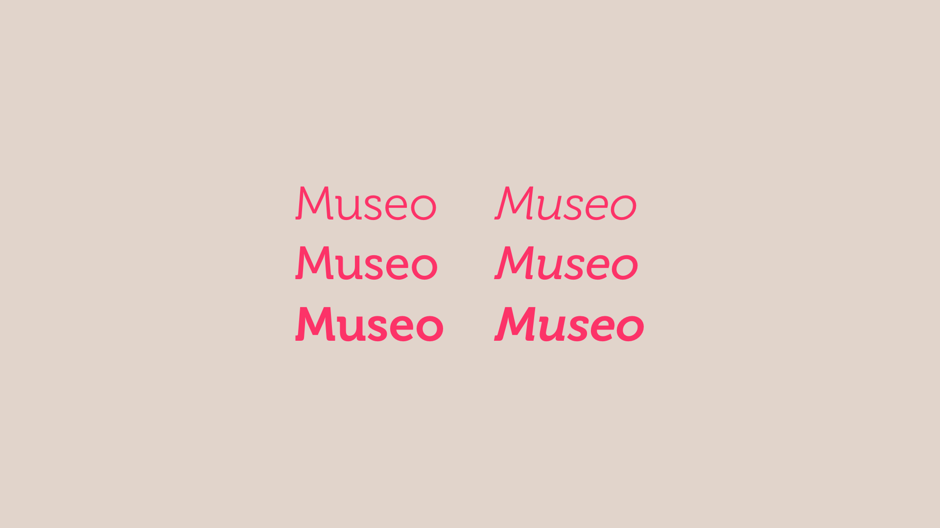
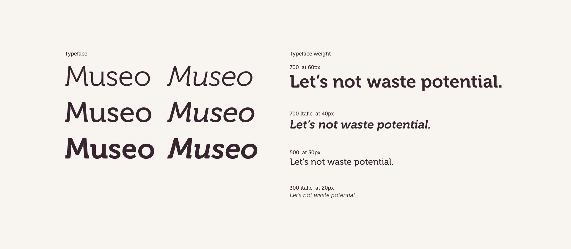
Considering font, typeface weight, and the italic style was crucial, emphasizing the visual tone, movement, and aesthetic of this direction.
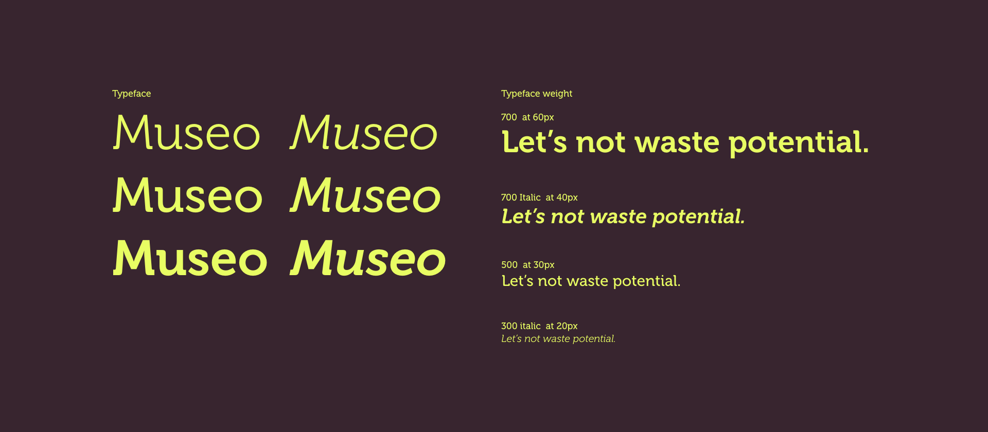
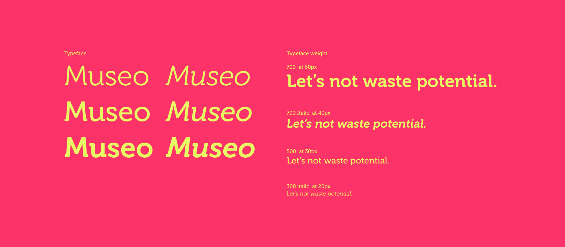
Type face
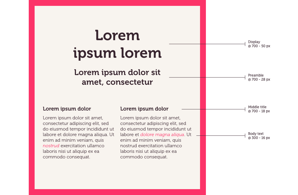
The hierarchy in Redo's text is crucial for highlighting the importance of its content. Ensure a clear distinction between different text sizes to make the hierarchy easy to visually understand. Using as few sizes and formatting options as possible – never more than two weights and more than four sizes within the same layout. Redo's main weights here are Museo 300, 700, and Italic 300, which are used only to highlight detailed text.
(04) Strategy
Creating a truly sustainable energy cycle is a large undertaking, and it’s going to take a lot of work and a lot of collaboration, involving the agency, Redo's co-workers, and each of the affiliated companies that we are merging, markets, and competitors.
As Redo creates these solutions, circularity is key to making sure that they don’t do more harm than good as we create and consume.
Redo take the circular concept and perfect it; "we don’t just leave it at good enough, but we continuously improve, perfect, and do things over to make sure that we can create true closed-loop circular processes."
"We go beyond 'good enough', embracing the cycles of continuous improvement – and doing again that which already works perfectly."
This makes Redo ready for the future, and the Swedish word for ready aligns perfectly with our process and what we do, redo.
Fun fact – as we were presenting the final draft, and the visual reference on one of the symbol/logo directions on the Microorganism. Then suddenly, while we were presenting the direction, one of Skagerak's employees said with determination and straight face, "The microorganism looks like a cheese doodle!" – And his co-worker screamed out, "We are doodlers" – yeah! Doodlers of biosolutions! And it hit!...
(04)
The End
(5)____
Next Case
Helsebesøket
Branding / Tone of Voice / WEB Layout
Case study on its way