

(Scroll)
Invo website redesign
Invo website redesign
(02) Project Overview
Invo
Invo is Norway’s leading software company, offering the market’s smartest solutions for document management—all in a single, recognizable workspace. We create structure and control over documents so you can avoid frustration and work more efficiently. Our vision is to make every workplace simpler through innovative solutions designed for the future. That’s why both small and large companies choose Invo. One window, one click, one workspace.
The
Process
Invo had long wished to improve its web user experience and its customer conversion to its products. So I took the challenge to redesign their website UX (logic) and uplift their GUI with their existing brand elements. At the same time, I wanted them to highlight the value and priority of their products, so it could resonate in a much faster and intuitive way with the user. So we recommended them at the same time to brand their products with explanatory elements – take a look at how we branded their product catalogue before we executed their new Website.
I started to study their web roadmap and logic, to understand the time consumption and steps that the user had to travel before reaching their goal or product. With several user tests, interviews with the users, and their needs, I had clear data and a goal on what needed to be implemented.
Our first step was to have a meeting with Invo's website dev team to discuss the first draft of the wireframe and its logic, and how they wanted the prototype, elements, and logic description to be. So we provided an interactive prototype for both the desktop and mobile versions, with a logic description on each step, and a dev description with its element codes. This was discussed with Invo's dev team for a much smoother transition, so that Invo could execute the development of their new website.
(Details)
AD / UX / GUI / Prototyping
Engagement
B2B
Model
Tech
Category
Rebrand
Type
Gambit Hill + Knowlton
Agency
Mappping the user path
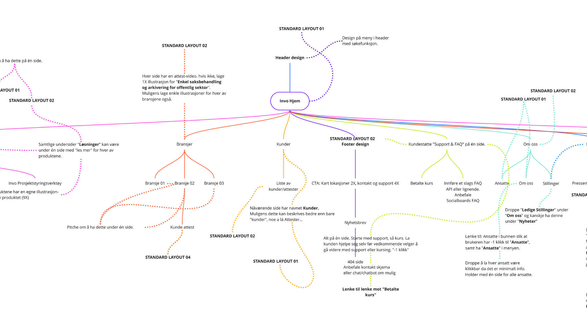
The strategic path on the user end – and how to improve the user's travel from point A to B – or C...
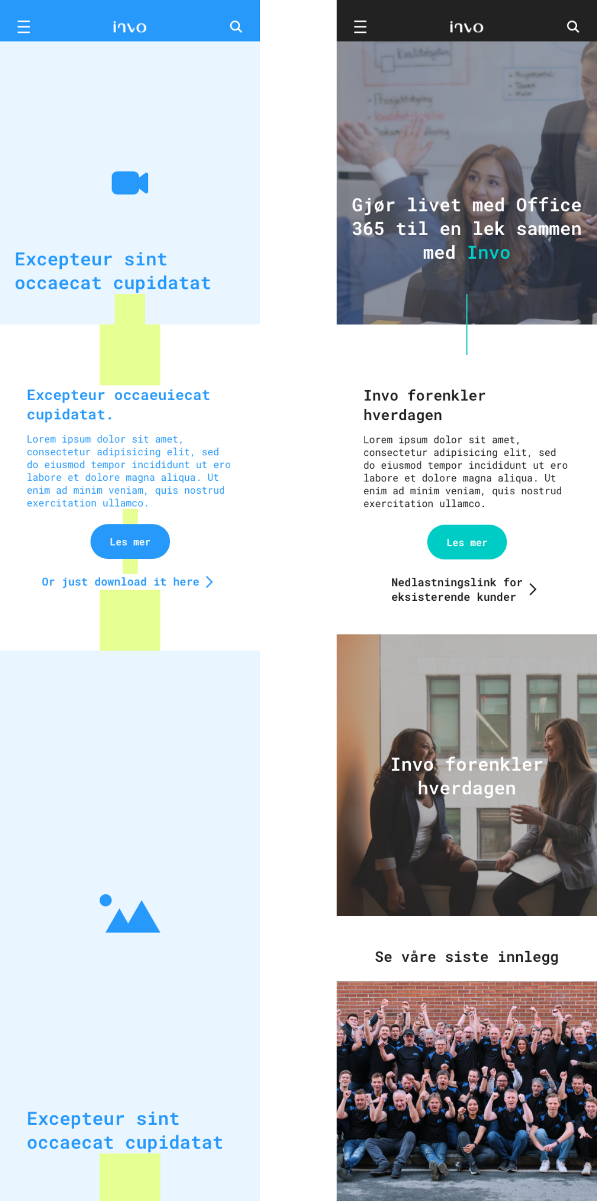
Wireframes
From the wireframes reference, with spacer block safe margins, and all the way to our final prototype for review with Invo and the Dev team.
(02) Wire frames / Output
Each step was crucial to highlight the user journey, keeping in mind all the correct and erroneous steps – this is to make sure that the user gets the right information at the right step.
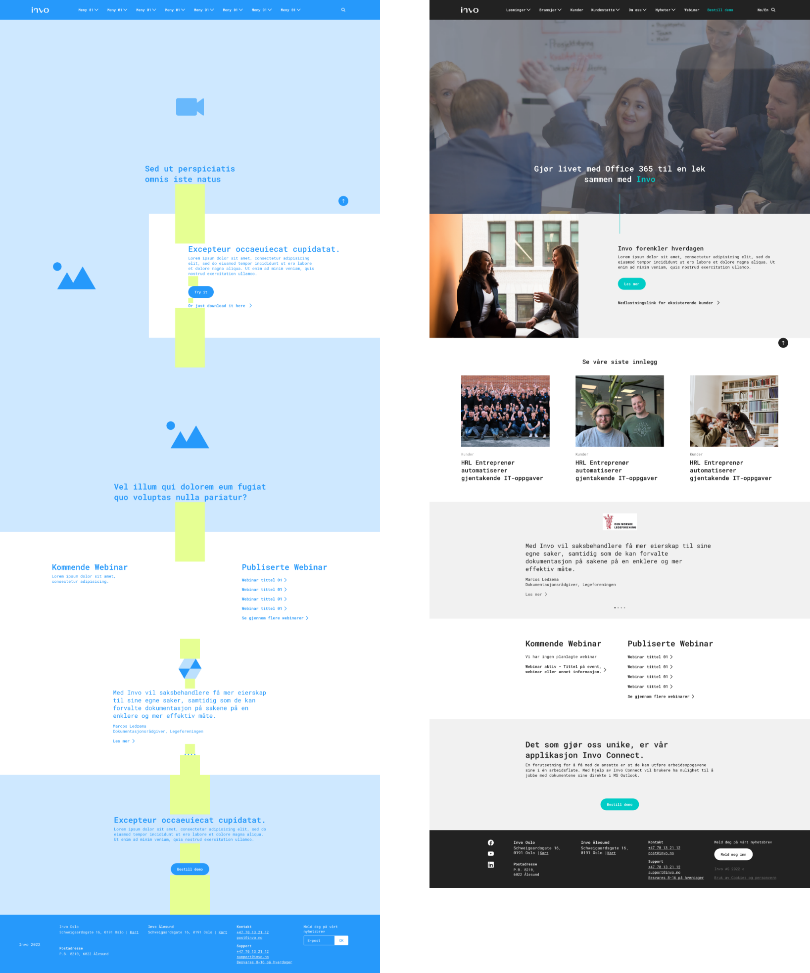
Showcasing the sense of the UX and GUI path on the Desktop and Mobile ratio / device.
Glimpse on the user path / Logic
(02) Branded product catalog
As part of this user-focused transformation and highlight, we recommended identifying the value and core of each integration / product. This brought great value and focus to each highlighted product, with a whimsical touch. We wanted to catch the interest and attention of the user, and at the same time, make each product strategy and design relatable to its product and role.
Head over to glimpse how we identified and branded Invo's Product catalog.

(01) Strategy
Invo wanted to improve its website’s user experience and boost product conversion, so I took on the challenge to redesign its UX and uplift the GUI using its existing brand elements. By analyzing their web roadmap, running user tests, and conducting interviews, I identified friction points and opportunities to streamline the user journey. We enhanced the product catalogue with explanatory branding elements to highlight value and guide users faster.
The project included interactive prototypes for desktop and mobile, complete with logic annotations and developer-ready specifications, ensuring a smooth handoff with Invo’s dev team. The result is a seamless, user-centered website that merges strategy, clarity, and visual appeal, making product discovery intuitive and engaging.
(02) The End
(3)____
Next Case