(Scroll)
Helsebesøket Branding
Helsebesøket Branding
(03) Project Overview
Helsebesøket was born and inspired by its founder, Ida Katrine Heinfelt. She had a strong vision for human-centric and holistic healthcare that focuses more on the human bond and emotional connection. She draws her holistic, alternative approach from years of experience in the medical and nursing fields. With this, she felt that something crucial and deep was missing — the human touch and connection, in a much more personal and deeper way.
With this dream and drive to offer this approach to the world, she gathered all of her knowledge and created a collective of like-minded practitioners, so they too could offer this approach to users in need of a more holistic, human-centric healthcare.
Her vision for Helsebesøket’s identity was a closeness to the earth, humans, and nature. Keeping in mind the core idea of the health-oriented approach, and how we could pinpoint the identity through both visual and color psychology, it could resonate with the modern world.
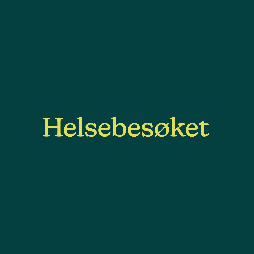
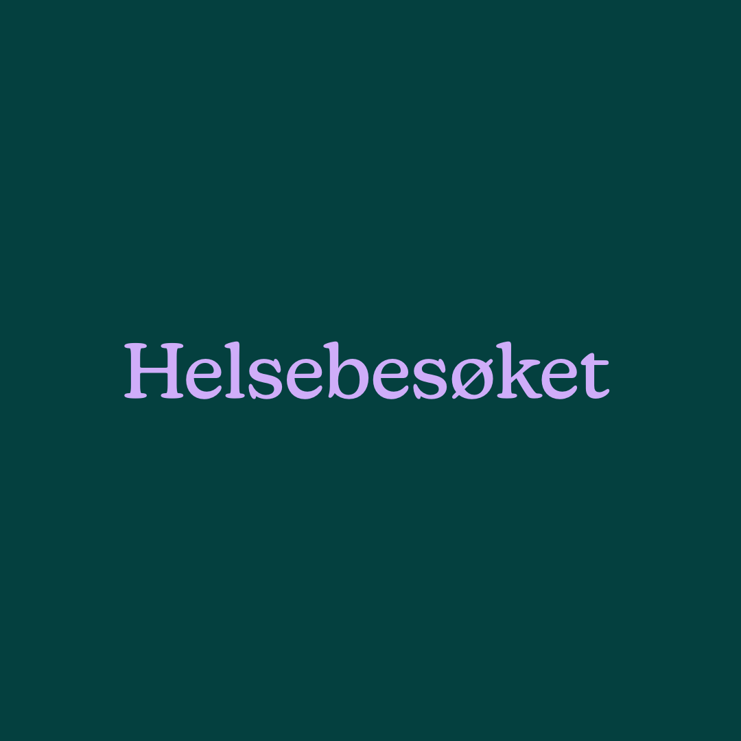
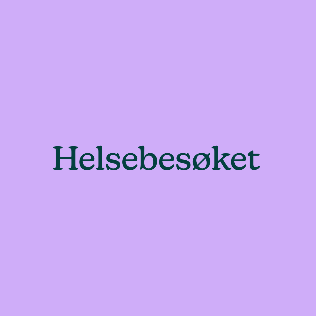
Helsebesøket
The
Process
When Ida Katrine came with her vigor and took us for a ride through her idea and dream of what Helsebesøket’s identity could be, it was driven by such passion for helping her fellow humans. She clearly saw how this specific part of human connection and the human-centric emotional core was missing in the healthcare system.
From this stage, we felt her desire to help people — not just to create a base for a holistic healthcare system, but to gather this type of knowledge and passion for human connections and emotions.
And based on her user market, keeping in mind the age gap between younger users and senior healthcare users, we needed to create an identity that resonates with the modern user market, with its simplicity, direct references to services, and information. At the same time, minding senior users through color rules for better visibility, large icons for clearer service navigation, and clear language.
As this data came into place, the team and Ida Katrine created Helsebesøket’s identity look and feel, based on the insights we gathered to create a whole universe for Helsebesøket, and to maintain its red thread across several devices, formats, and into the physical world.
(Details)
Branding / Identity / Tone of Voice
Type
Healthcare
Model
Private Holistic Healthcare
Category
AD / Designer
Engagement
Hill & Knowlton
Agency
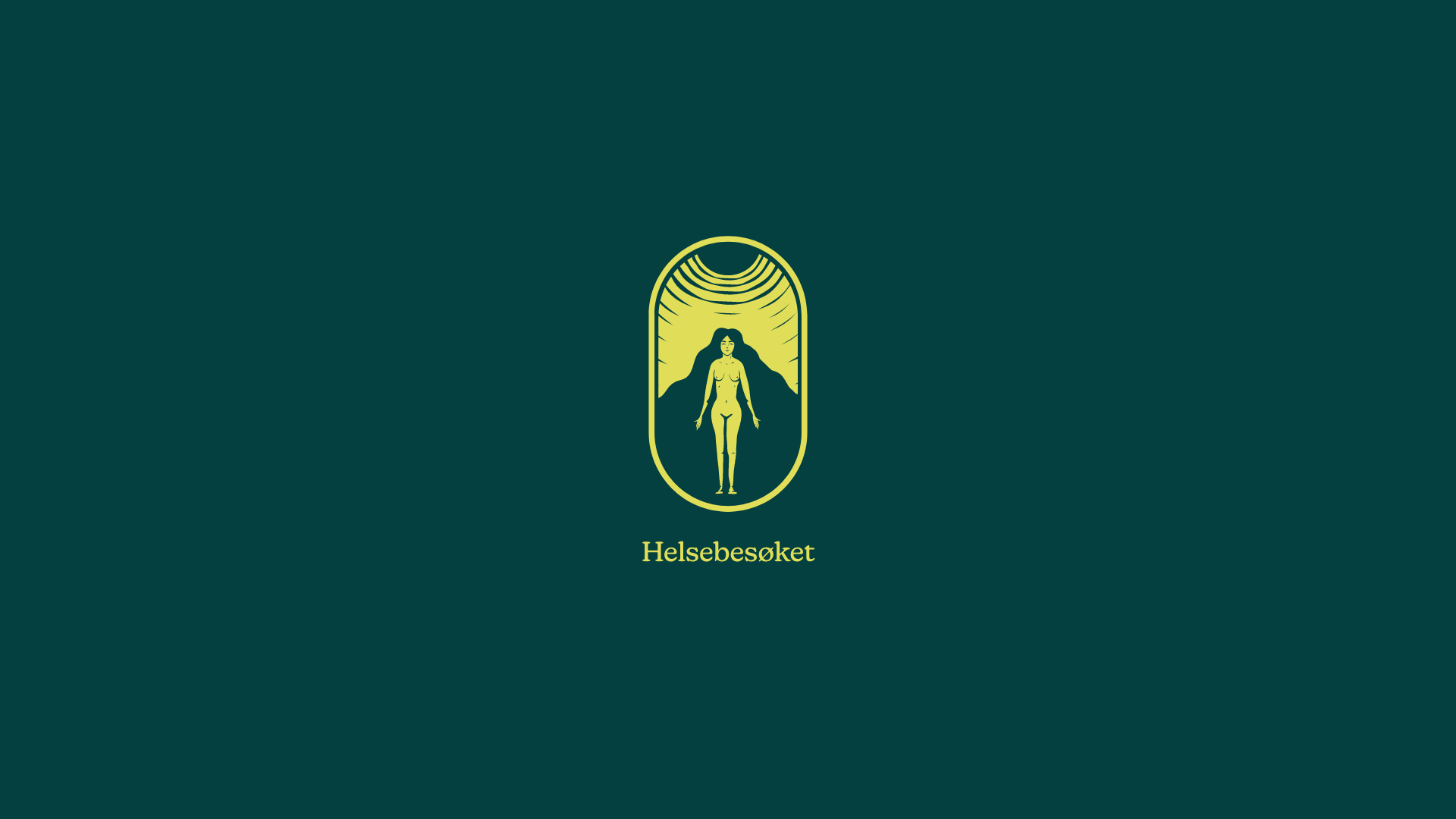
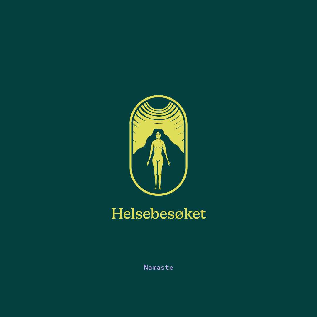
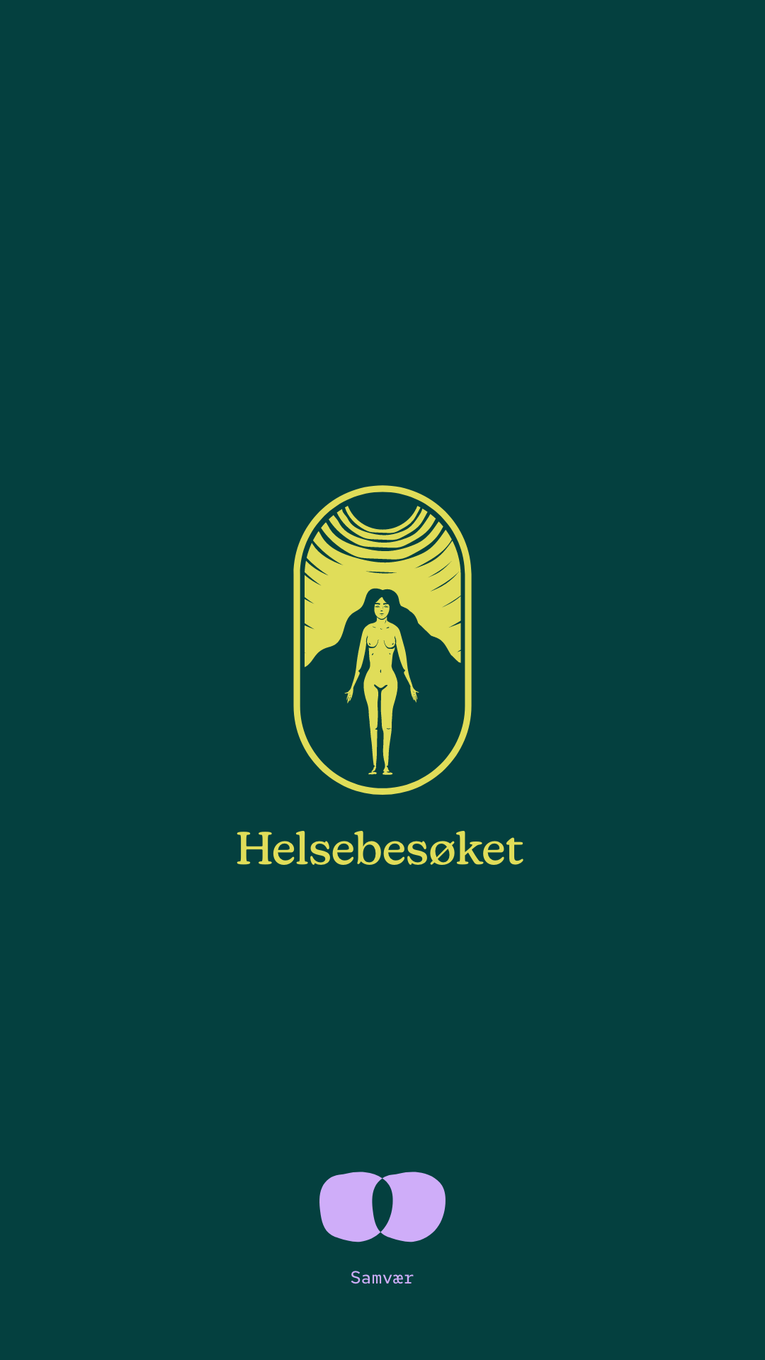
Primary Logo

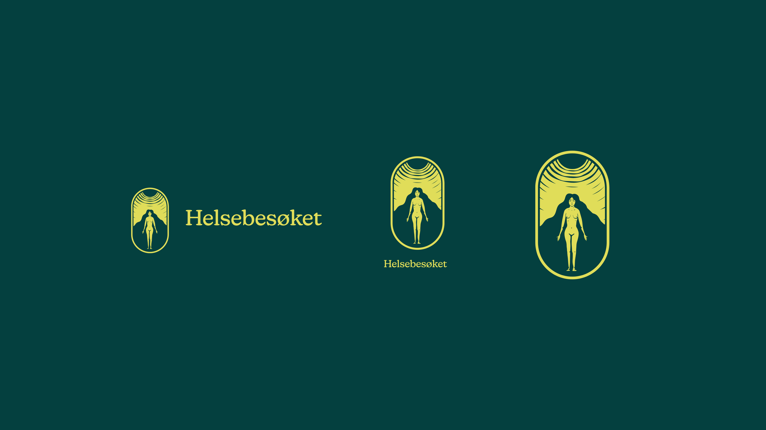
Logo / symbol compound
The compound is to add hierarchy to its logo weight and ensure exposure, keeping in mind diverse digital devices and physical formats.
The symbol was inspired by the desire to keep the motherly earth feel, kindness, and openness to all forms of humans in different states of their lives. As the sun gives light and energy, it symbolises the sun at the top of the logo – and the warmth it creates, and gives.
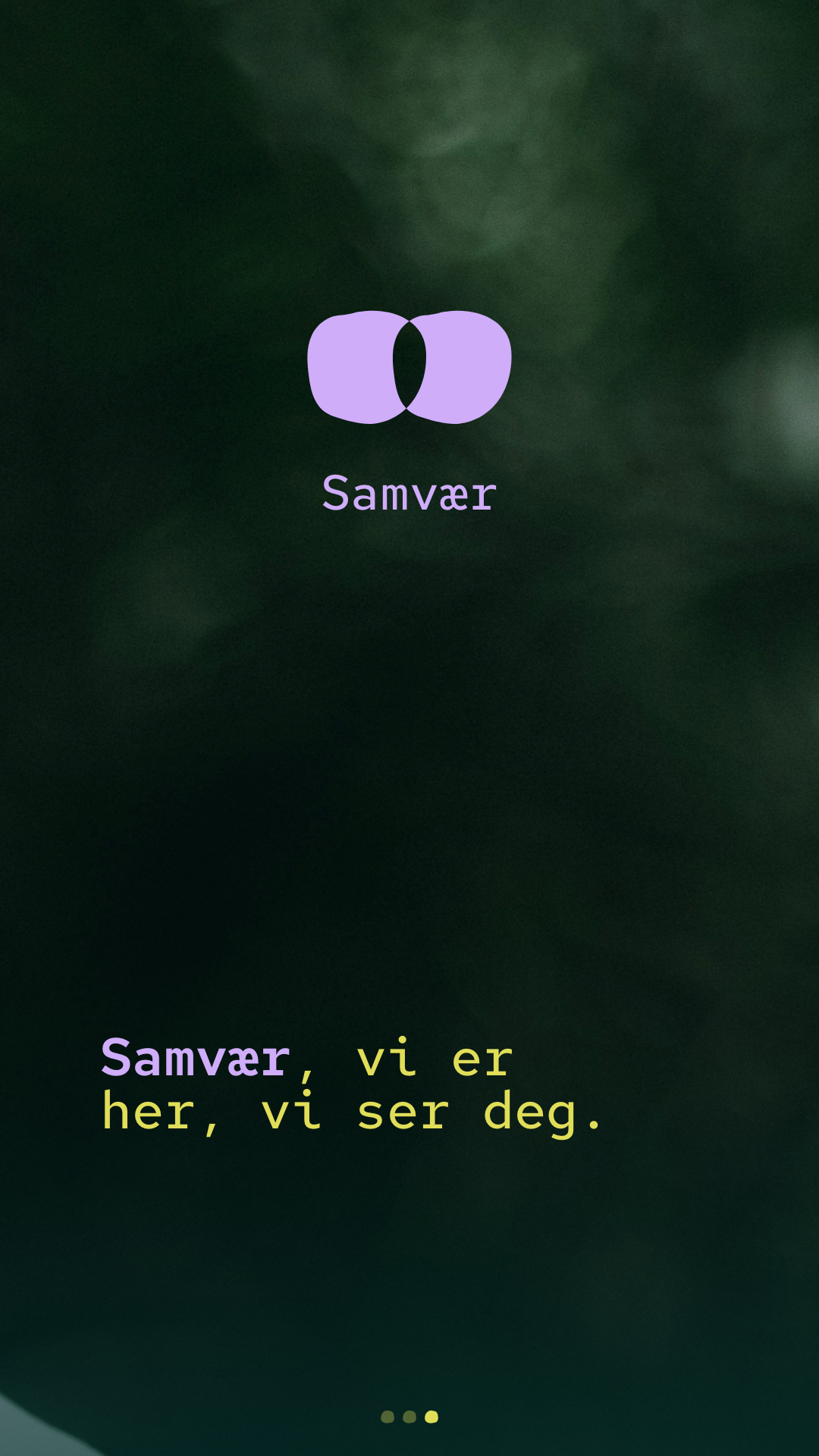
Services / Product icons
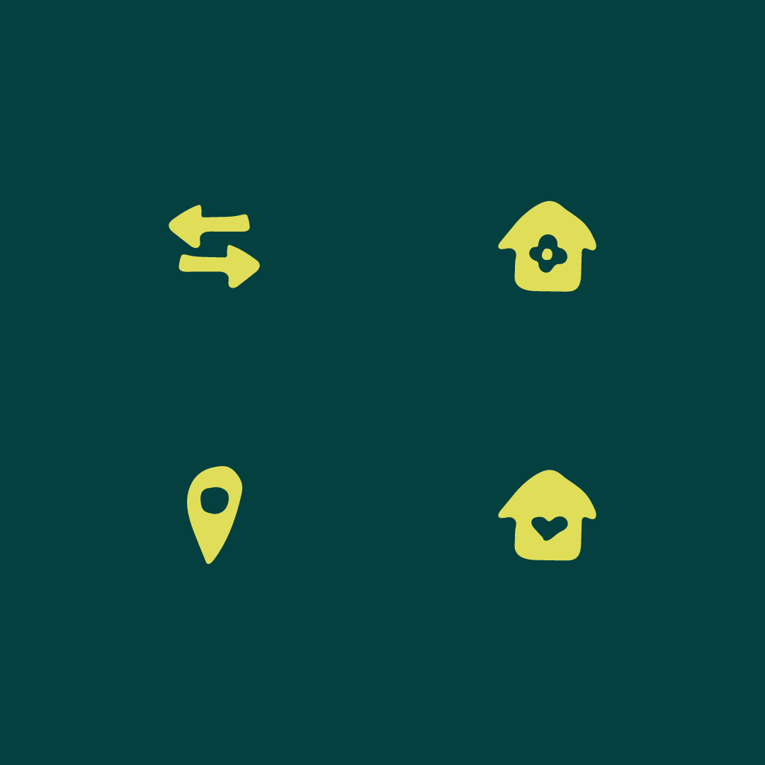
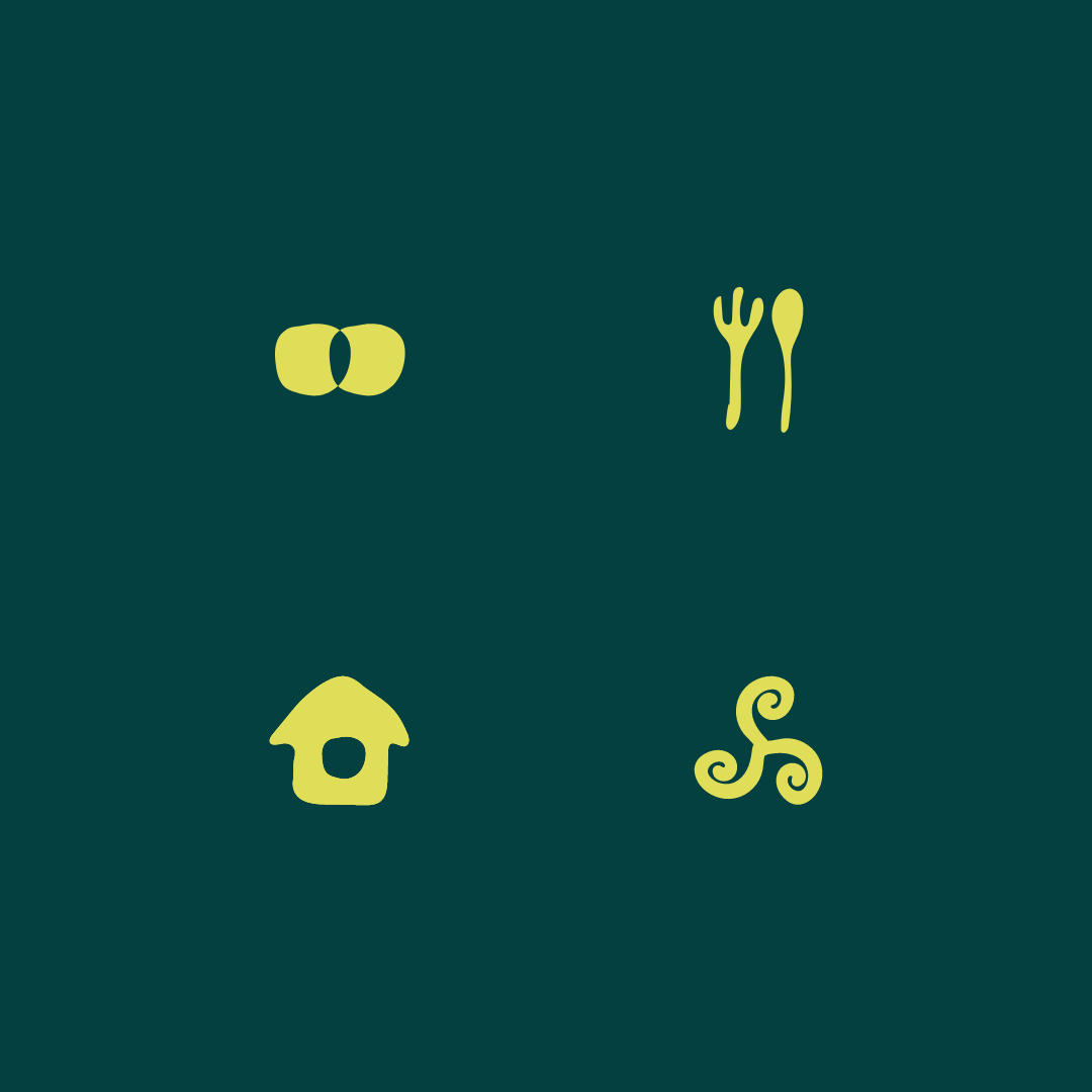
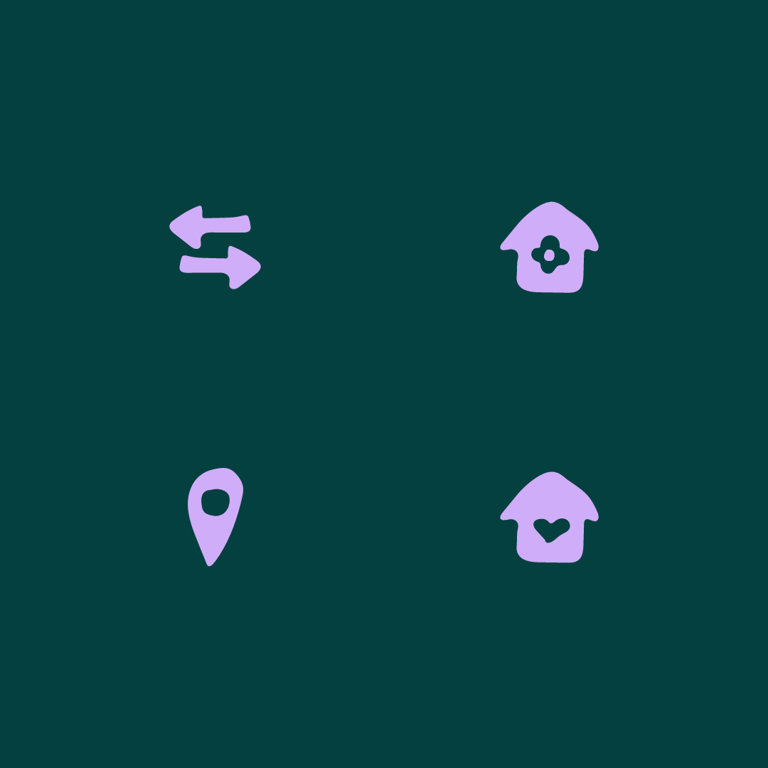
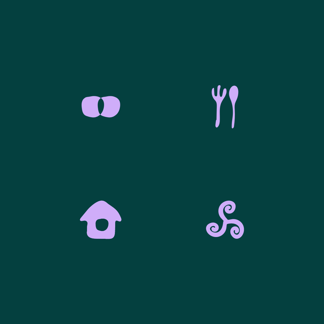
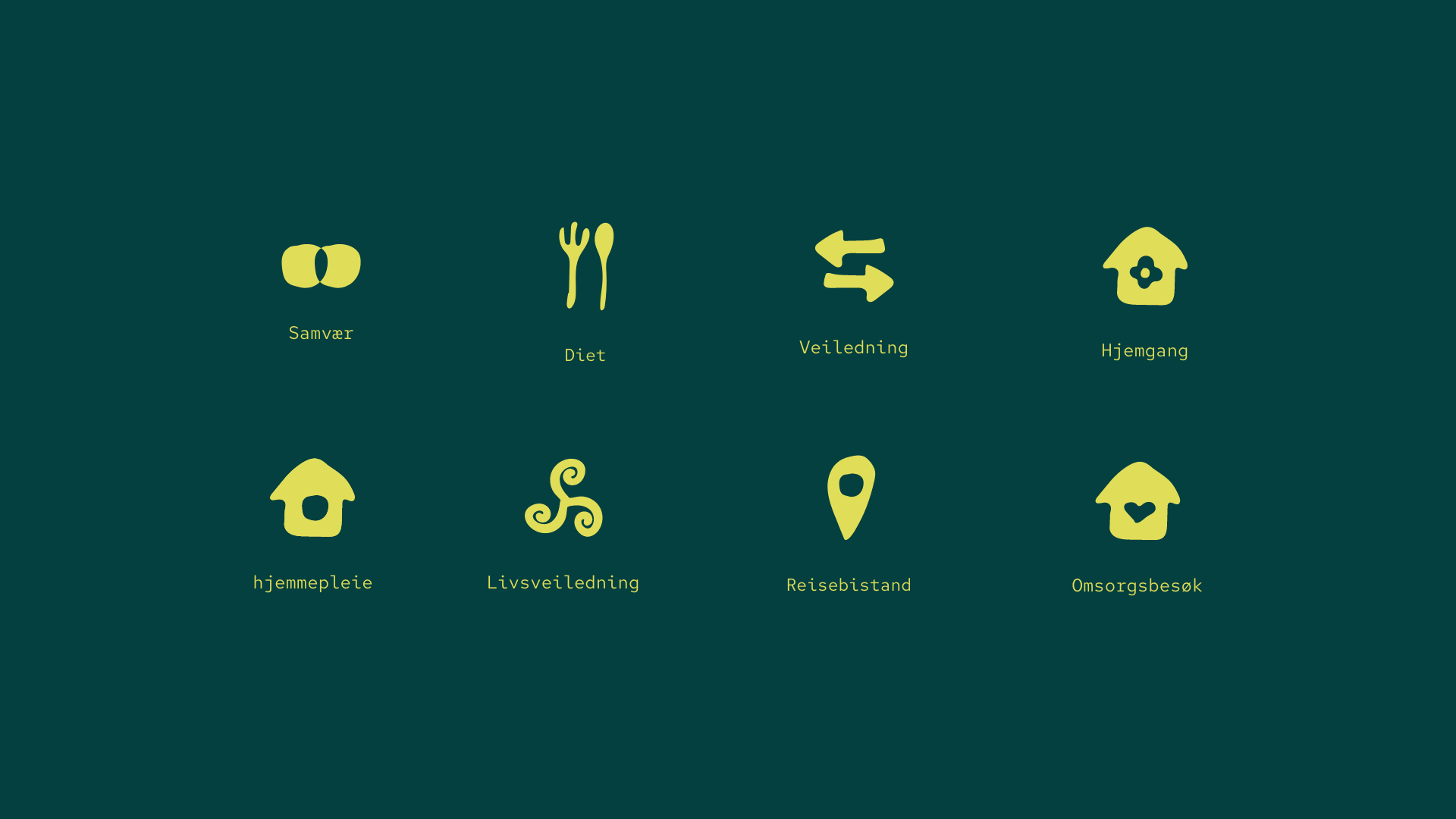

The service symbols were created with simplicity and function, for a much better reference to the product, and the contrast colors keep them highlighted when using the brand's color combinations. A bold and bulky design was added to the icons, so that the symbols could be used in several outcomes, color combinations, and devices, without the need to add the product description.
Keeping in mind the WCAG rules and contrasts for universal exposure.
Imagery / Look & Feel
(01) Strategy
Helsebesøket is strategically positioned as a human-centric alternative to traditional healthcare, addressing a critical gap in the system: the loss of emotional connection and genuine human presence. Rooted in founder Ida Katrine Heinfelt’s professional background in the medical and nursing fields, the brand builds strong credibility while expanding healthcare into a more holistic and emotionally grounded approach.
The strategy centers on restoring the human bond as a core value, where care is not only about treatment, but about connection, trust, and presence.
To scale this vision without compromising its values, Helsebesøket was developed as a collective of like-minded practitioners who share the same holistic philosophy. This creates a harmonious ecosystem driven by shared knowledge, empathy, and a deep respect for human needs, positioning the brand as a movement rather than a single service provider.
The brand identity is anchored in closeness to nature, earth, and humanity, using visual and color psychology to evoke calm, warmth, and trust. This grounding in nature reinforces the holistic approach while ensuring relevance in a modern healthcare context.
Strategically, the identity is designed to serve a dual audience: modern users seeking clarity, simplicity, and direct access to services, and senior users who require enhanced accessibility through clear language, strong contrast, larger icons, and intuitive navigation.
The result is a cohesive brand universe with a consistent red thread across digital platforms, physical touchpoints, and service interactions—one that balances emotional depth with functional clarity, and modern usability with human warmth.
Brand colors / Hierarchy
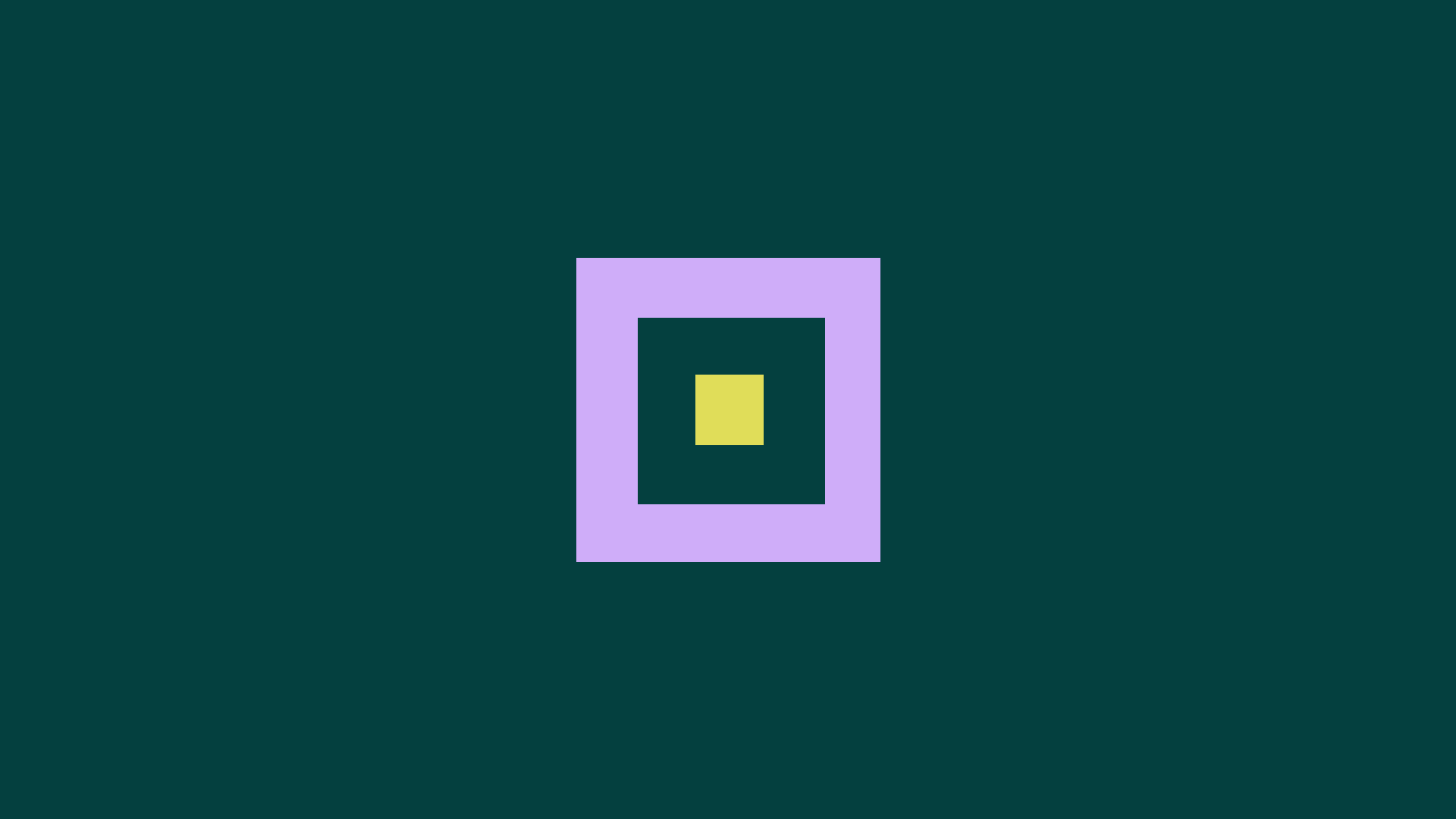
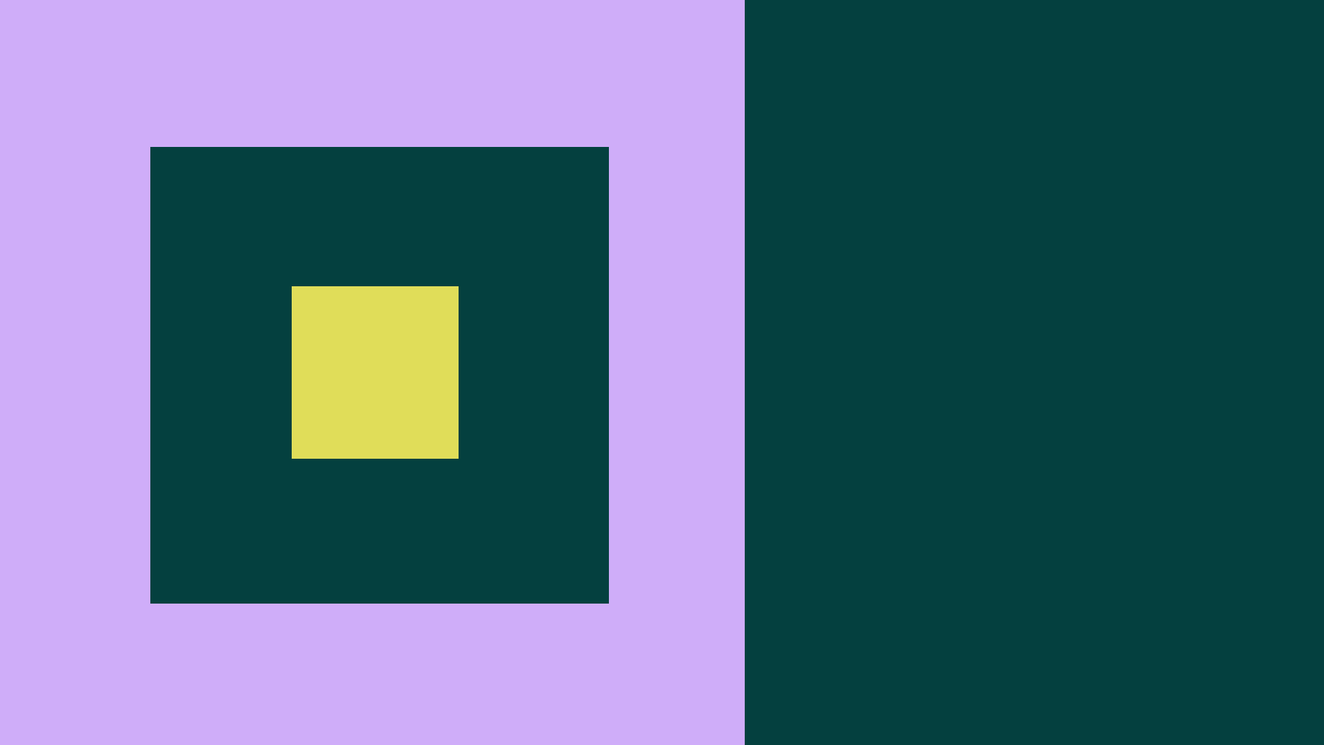
03 > Light Plum
02 > Midnight Forest
01 > Lime
The colors were drawn from the human's natural habitat – nature. Where the color Lime was the highlight of its nature, when the sun hits it the most. Light Plum was inspired by the vibrant energy and compassion of the warmth that is created from the complementary colors Lime and Midnight Forest. The color Midnight Forest refers to the deep nature and its warmth when combining the supporting colors together as one brand.
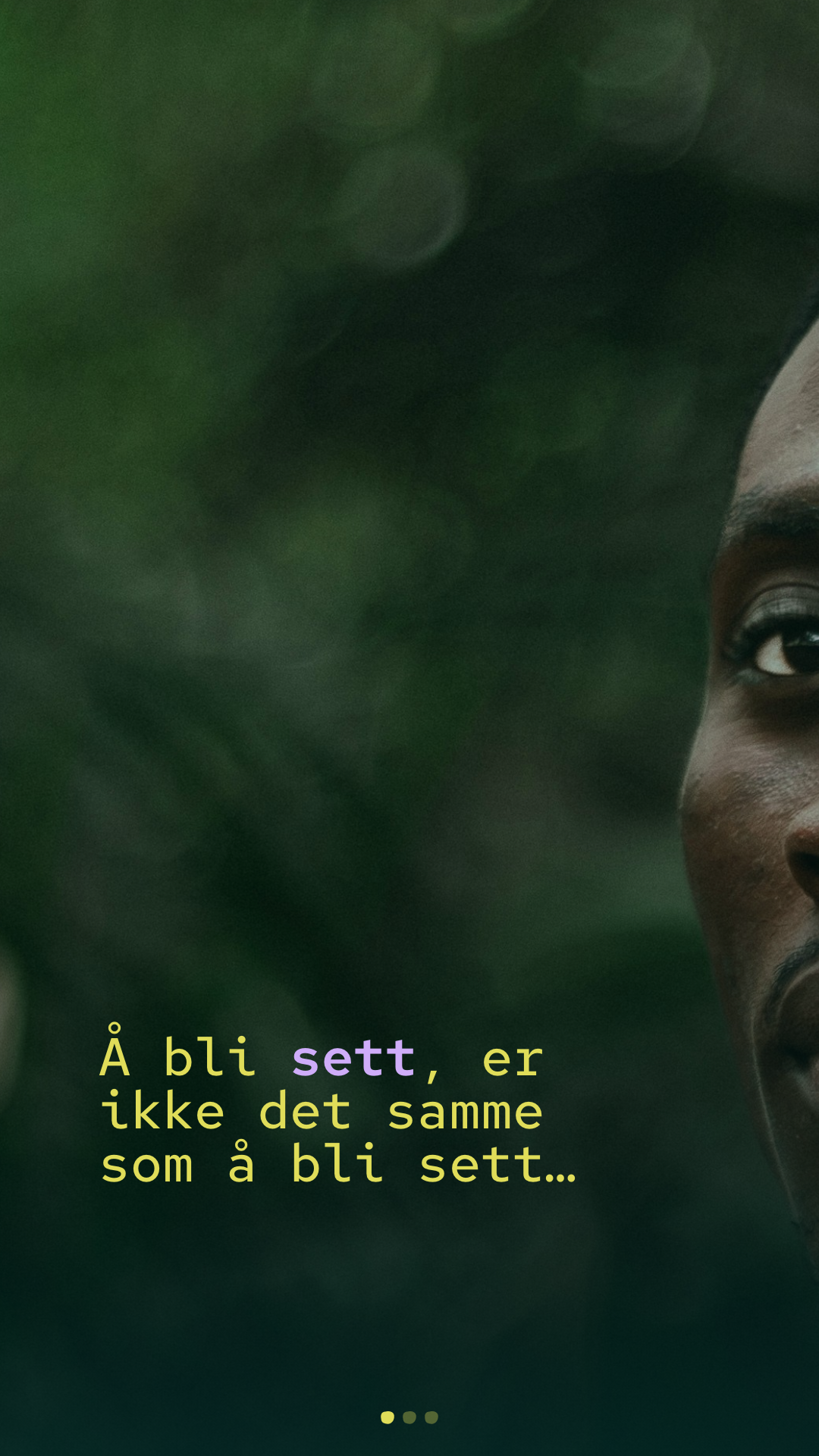
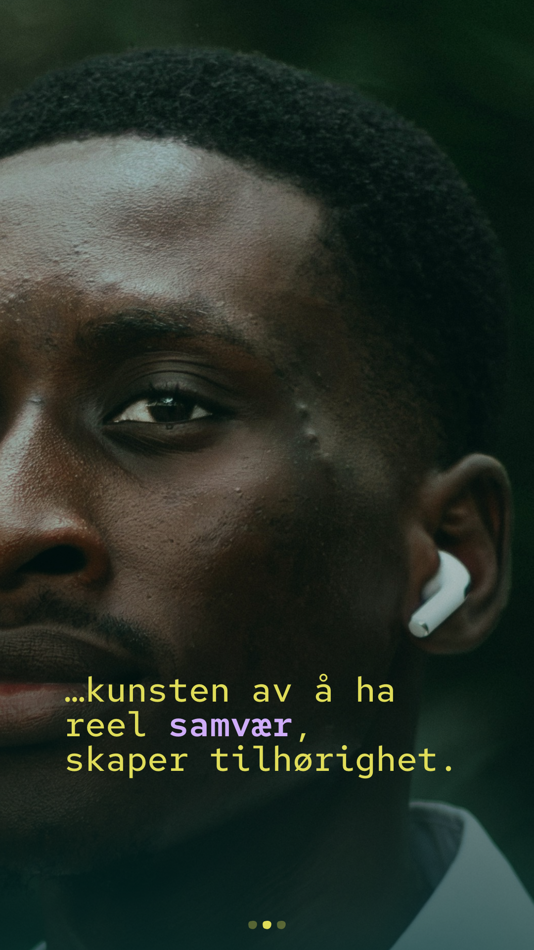
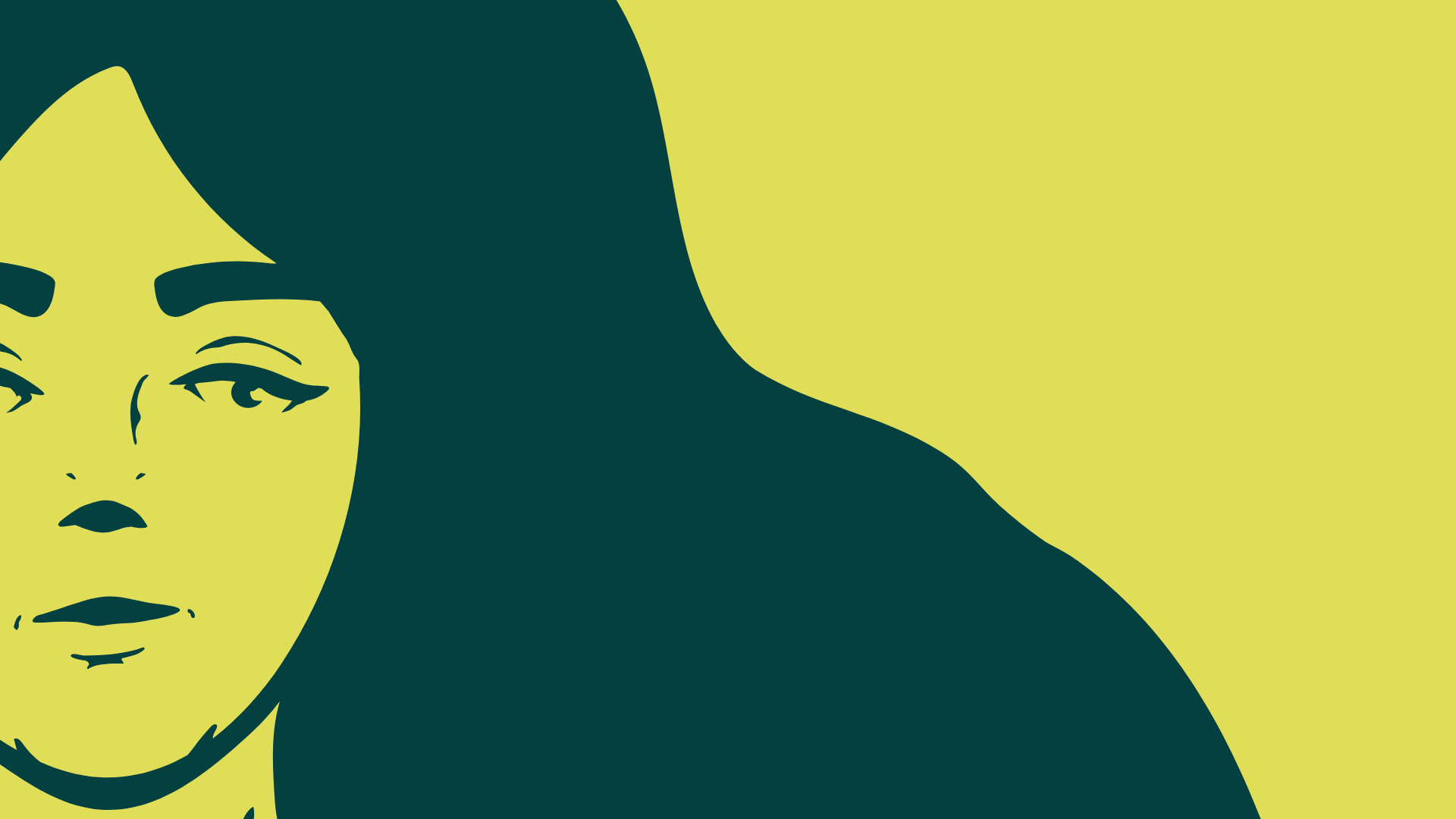
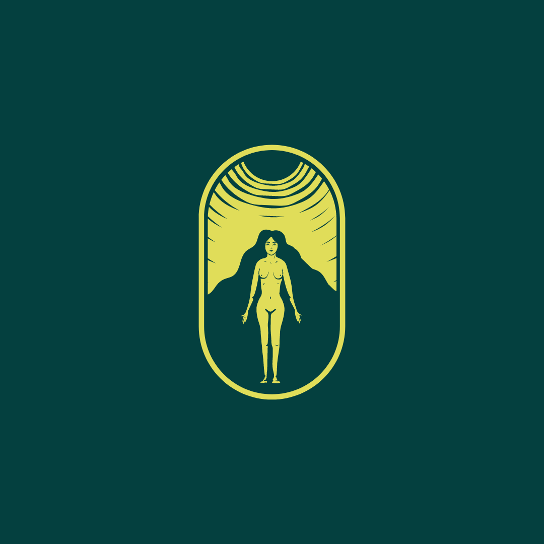
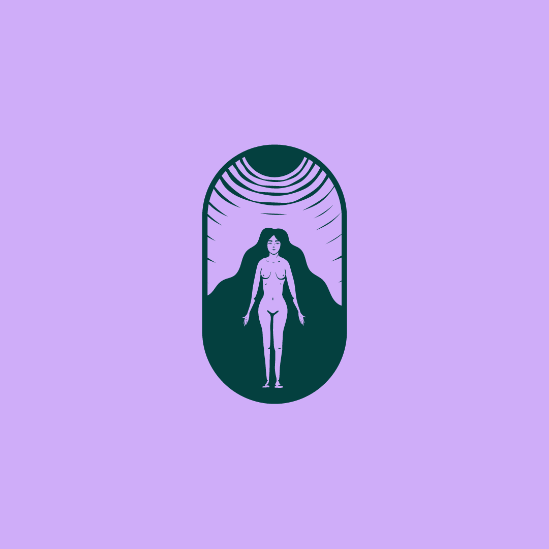
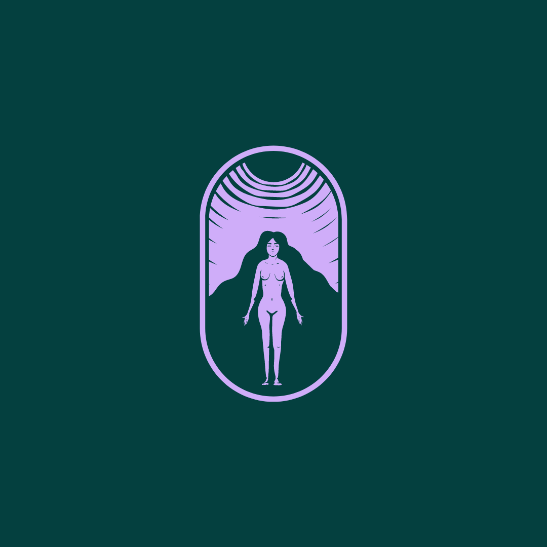
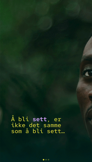
Product intro on SoMe
The trigger and focus were on adding the essential feel to the product and relating to its emotional output, and how it could relate to its audience and targeted market, without losing the trust in Helsebesøket's mantra.
The focus was to give a sense of personal space to the focus person, at the same time, show feelings and facial emotions so that the focus target could relate to the feelings they have, or felt once in a while.
SoMe videwo / short
(03)
The End