

The challenge
How’d we gathered up the brand’s essence and soul – while shining a light on the real challenge: fighting the black market that undercuts prices, strips away value, heritage, and disrespects the farmers and the land? How could we make the brand feel that struggle, and stand with the farmers chasing a stable market built on unity between growers and brokers?
Well, the name says it all. After sitting down, sharing stories, living with them, and really hearing the farmers out, we got to the heart of their fight and let that truth shape the brand from the ground up.
We didn’t just read reports, data or let AI tell us what to feel: we pulled up, boots on the ground. We kicked it with Los Acosta in Peru, soaking up the grind and the daily hustle of real coffee farmers. We lived it, breathed it, walked the fields, felt the sun on our backs, and tasted the dirt under our nails. That’s
how we tapped into the roots of their core values, by being there, living as them, and alongside them for weeks.
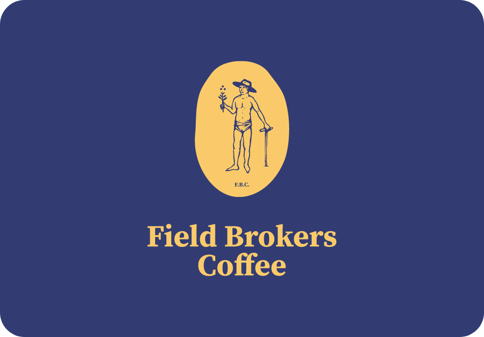
With that vibe running through us, we were ready to brand Field Brokers Coffee: name front and center, symbol loud and proud.
Take a peek behind the work of crafting a coffee brand’s identity and keeping it real to their core.
Rooted in heritage, responsibility, traditions, and unity – that was the compass. All of that flowed into shaping their symbol, nailing the name, and sketching the wordmark.

– Intrigued?
Continue the rabbit hole
Main Logo Symbol & wordmark


Main symbol with its two main colors implemented – and it negative supporting color.

Wordmark in focus with its main two colors.


Main wordmark and symbol together. The following usage is the main practice of the brand's logo and supporting negative space logo.

Logo weight
Wordmark and symbol jointly. The following usage is the main procedure of the brand's main logo.

Complementary symbol
The complementary symbol for support usage on content, pattern, or merchandise for greater exposure.
Highlighted Challenge:
Logo challenge and symbolism
Trying to capture the essence, values, heritage, and timelessness in a single symbol. I’ll bow down and admit this was quite a challenge – especially when trying to respect the client's wishes and find that sweet spot where I (and yes, I nailed it! 😎) made sure it stays consistent and balanced within FBC’s visual harmony and hierarchy. Well, here are some of the outcomes we wanted to highlight: organic, timeless, grounded, and with a core visual reference – the coffee farmer.

Wordmark compound
The components were the main influence to identify the brands feel and identity towards its core values.


Even the smallest cup presents the details and the responsibility of the brand and its identity.

Why not exhibit your passion for coffee in the outer world?


Complementary main symbol
Complimentary use of the main symbol to support appearances or presentations.

Implementation
Identity practice on coasters, business cards and signage.
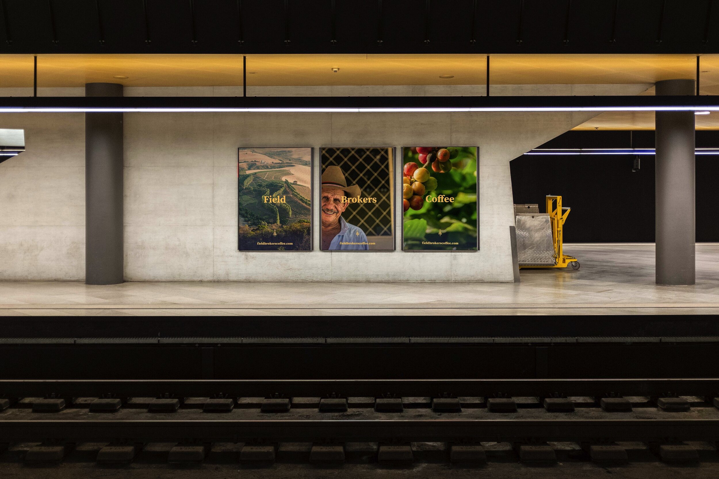
Signage concentrating on the brand's message on its core values
The end
We were hyped to team up with FBC — diving deep into the grind, the challenges of the trade, and the real respect they hold for the plant, the farmers, and the sweat poured into every single bean.
Trying out farming and its land
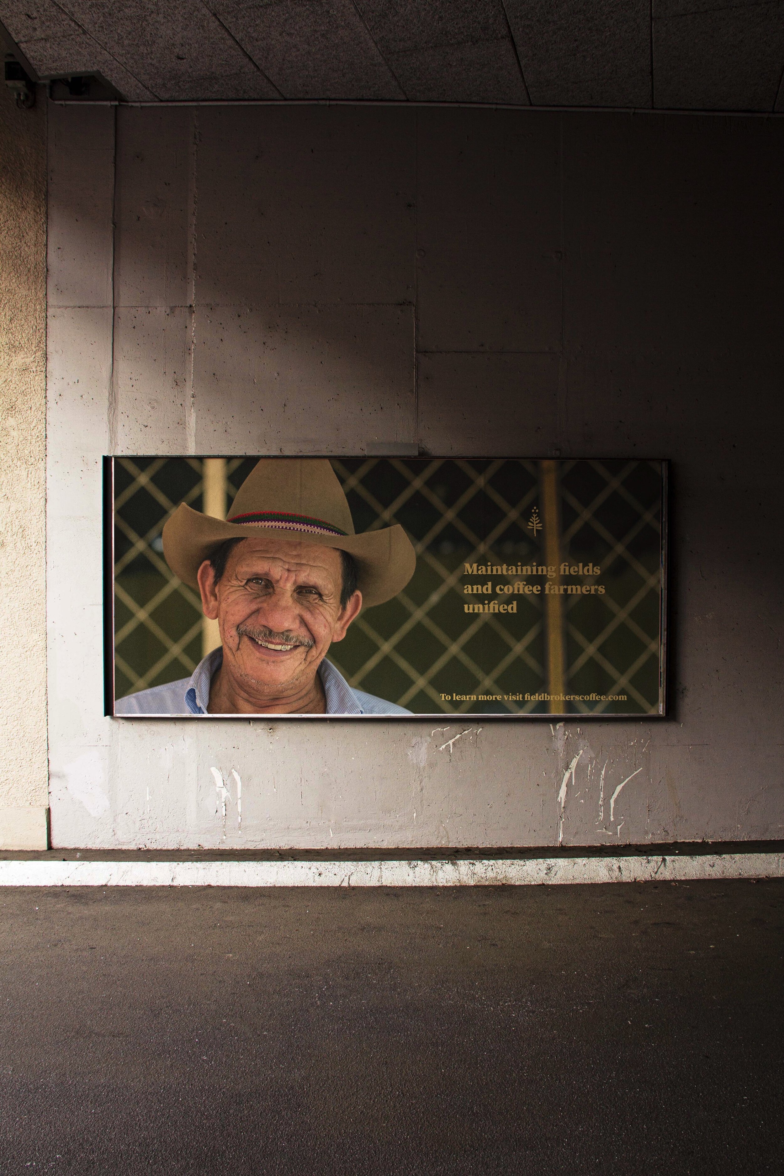
Local farmer after his nap
Farmers kids joining the fields
– Case done, have
a affogato now!