
eAccounting rebrand concept

We had the incredible opportunity to craft a cutting-edge rebranding concept for Visma eAccounting, completely reshaping their brand essence. With the liberty to infuse a fresh vision drawn from their invaluable customer data, we embarked on a journey to redefine and elevate their entire brand experience.

Color pick
Main color: Augmented connection color of blue
Secondary color: Monochromatic of the color red


Complimentary color Inspired by Monte dei Paschi of Siena Banca from 1472

Division & Multiply

Merged symbol with division and multiplication symbols


eAccounting aspired to stand out as a modern, smart and playful firm.
With some whimsical elements expressing their system and how simple and intuitive the software is


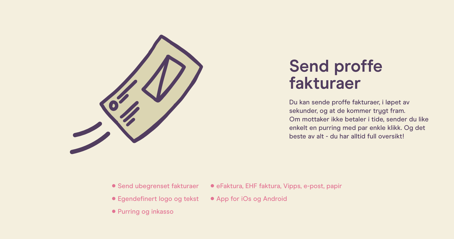
Exposure in a humorous way showing how eAccounting can help your company grow.


Merch for everyday goods

Business cards focusing on the main symbol and exposure of eAccounting's brand colors
Connecting with current and new clients is crucial through a digitalized society.
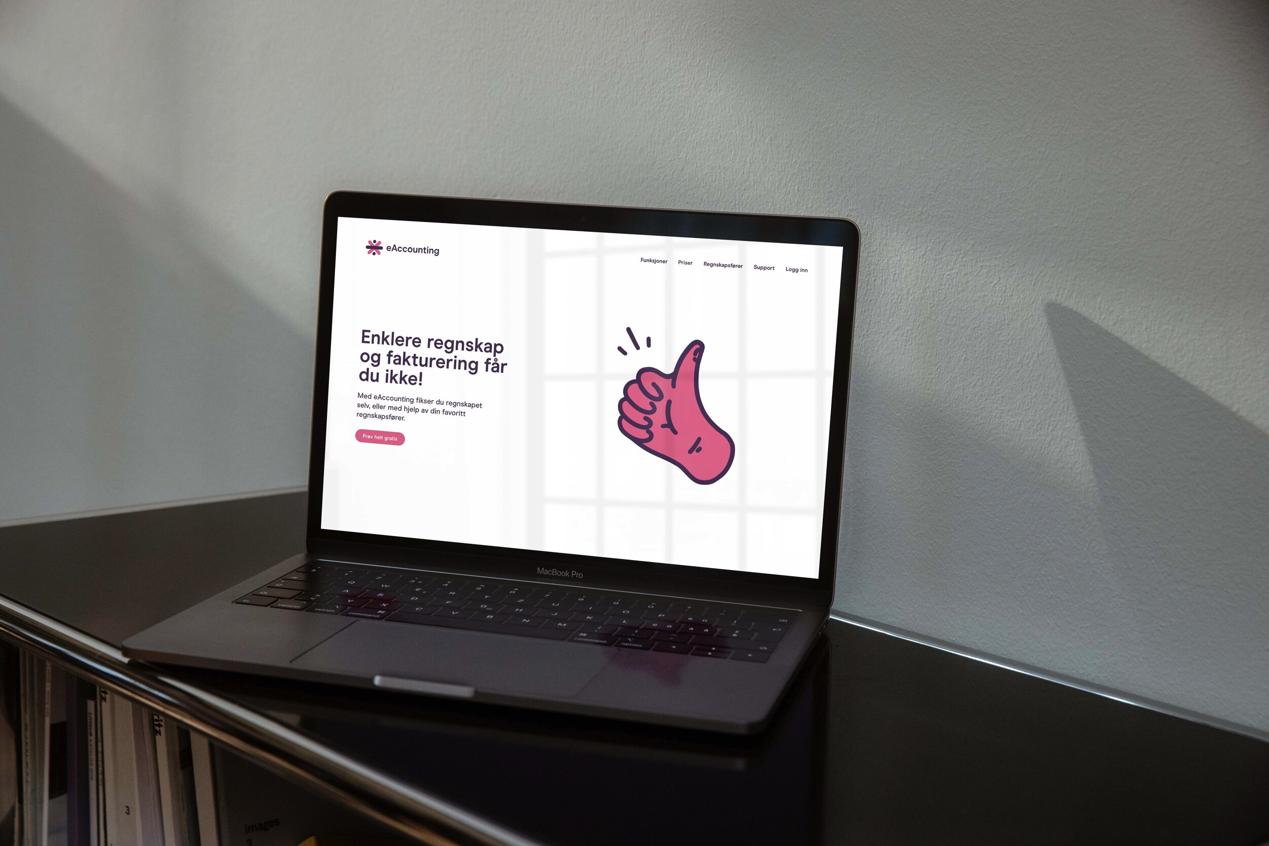
We also had the chance to come up with their UX path on eAccounting's website and how to talk to their visitors in an informative and playful way.


Our process with eAccounting
As an open project that Visma (owner of eAccounting) granted for some agencies, we were given the chance to come up with their new identity and how to appear more appealing and functional in these demanding and changing times. We aimed for a more personal relation towards their customers and a much more open-minded reach and understandable expressions.
Their new identity is based on their customer feedback data that was given to us so that we could translate it to their new identity.
The colors were extracted out from their old identity and augmented into a much more lively and connection with our current design era. The colors were based on lightened colors and bright tones so that they can be changed in the future with minimum disruption towards their current identity.

Next case